Auto NewsMarch 3, 2020
BMW Has a New Logo and This is What It Looks Like
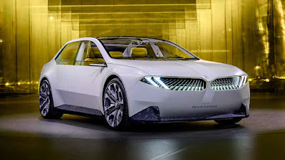
Forget the giant nostril grille for a minute. Yes, we know it’s hard, but we’re not going to be talking about that right now. We’re not going to be talking about this new EV concept either. Instead, we’d like to let you know that BMW’s getting a new logo and guess what? It’s been staring back at you right in your face.
Just as Volkswagen has done, and Kia’s about to do, BMW’s re-interpreting its trademark blue-and-white propeller badge for the new decade. While it looks remarkably similar to the current one, the execution’s very different.
The new design does away with any chrome and highlights, opting instead for a flat, two-dimensional appearance. More surprisingly, it’s actually “transparent,” removing the black background that’s been so integral to the badge for some time.
BMW says it’s doing this because they want to emphasis the car’s color more than its badge; or maybe they thought that the grille’s already too much in your face. Whatever the case, admittedly the effect on the BMW Concept i4’s Frozen Light Copper color is intriguing. Of course, this begs the question what the effect would be like on more subdued colors like black or white?
UPDATE: BMW clarifies that the new logo is intended to be used only in communications and branding purposes. This will not be used on the vehicles or even in the exterior and interior labeling of their dealerships. In those cases, the existing logo will be used.


This comment has been removed by a blog administrator.
ReplyDelete