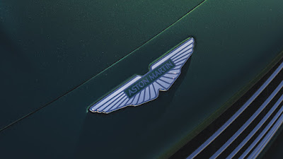
For the first time in 19 years, and only the eighth time in its entire 109-year history, Aston Martin is revamping its iconic wings logo.
Designed in collaboration with British art direction and graphic designer, Peter Saville, every millimeter of each line has been tweaked to make it more digital friendly, emphasizing that Aston Martin is a forward-thinking brand. It should also increase its appeal among the younger set as the British sportscar maker says 60 percent of clientele are new to the brand.
Yet, in its physical form, each badge is still hand-crafted by artisans in Birmingham’s jewelry quarter.
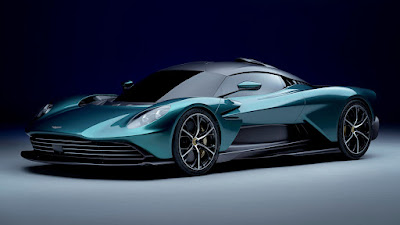
It will be applied for the first time on Aston Martin’s next-generation of sportscars, which will enhance their focus on ultra-luxury, performance, and driving intensity.
Meanwhile, its public debut is slated at the French Grand Prix where the Aston Martin F1 team will carry the new wings on its livery. Plus, celebrating the 100th anniversary of their first Grand Prix entry, the race cars will also carry the original button logo on the nose of its cars, mirroring the marque featured on its first Grand Prix entries in 1922.
In addition to the new visual look for the wings, Aston Martin also takes on a new global creative brand strategy: Intensity. Driven.
The strategic repositioning is the largest investment in Aston Martin’s brand for more than a decade and strengthens its position at the pinnacle of the performance ultra-luxury segment. It builds on Aston Martin’s growing appeal to a wider, affluent global audience strategically targeted by the brand, whilst underpinning its core values.


Looks cleaner
ReplyDelete