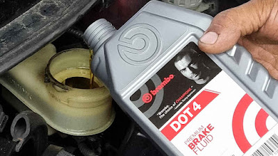
Brembo, the world’s leader in braking technology for automotive vehicles has revealed a restyled logo with a simple and modern design which is meant to be more digital-friendly.
“Brembo’s new visual identity ensures consistency between our promise and our image, powering our brand experience,” says Daniele Schillaci, Brembo’s Chief Executive Officer. “The core element of this new identity is the restyling of our logo, which is recognized all over the world and has contributed to our company’s success. Now it embeds the notion of simplicity, with a modern and digital soul capturing Brembo’s forward-looking attitude. The new visual identity expresses both the company’s heritage and its evolution and it will inspire our future.”
The new look Brembo logo is pretty close to the outgoing one, but with a softer, more rounded lettering. This makes it easier to read at any size, especially for digital activations.
The new logo will be rolled out globally across all of the company’s digital and physical assets, as well as on all of Brembo’s products in the near future.


The brembo lettering looks much simpler and clean.
ReplyDelete